REBRAND OR REFRESH?
World recognised search engine, Google, has recently undergone some change. You may ask, why on this earth, would a company that last year made over $14 billion and employs over 57,000 people across the world, think they should change their logo? They must be doing something right and don’t really need to change anything, surely?!
Not necessarily. Sometimes refresh is important – perhaps your business has had a change of management (in the case of Google, this is exactly what happened – Google is a part of a new holding company called Alphabet), or perhaps a particular element of the logo is dated and not reflective of the current times, your product or service offering?
It’s important to recognise when your brand might be ready for a refresh, rather than a complete re-brand and to ensure that you only change when completely necessary.
Let’s look at the changes Google made to their logo and discover the very specific reasons why they decided to forge ahead with a refresh, rather than a rebrand.
- Google have dropped the Serifs or in layman’s terms, the ‘little tails’ on letters in some typefaces, in a bid to appear simple, uncluttered, young and contemporary.
- The simple lettering is supposed to scale better to smaller sizes, making the wordmark more distinct and easier to read.
- The simplistic design also means a smaller file size and ability to display on low-bandwidth connections. The new logo is "only 305 bytes, compared to our existing logo at -14,000 bytes,” said Google. As one of Google CEO Sundar Pichai's big goals is to bring the internet — and Google — to areas of the world that don't already have it, that size difference will end up being quite a critical feature.
- So as you can see, it was definitely a well thought out and strategic decision to make change, in order to reflect the position of the organisation as it is today. Google are one of the most recognised brands in the world and they’ve ensured the changes they make are for very specific reasons.
It does spark the question in the minds of business owners and consumers alike – is your brand and logo in need of a refresh?
SEE SOMETHING YOU LOVE? SHARE IT!
>> VIEW OTHER POSTS
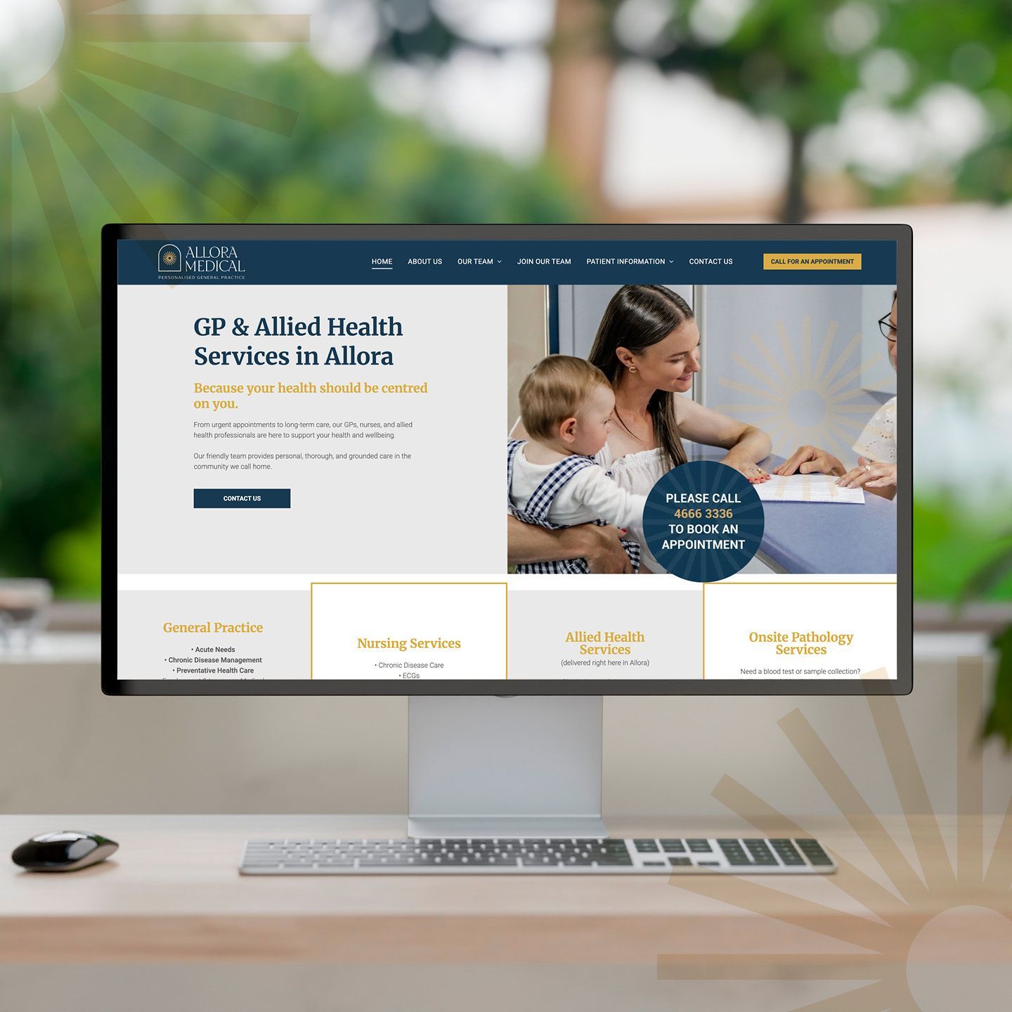
When Dr Claire Schmidt from Allora Medical came to us, she was ready for change. Under her leadership, the practice had evolved — embracing a more personal, community-driven approach to healthcare. But the existing brand and online presence wasn’t telling that story. The website and socials felt dated and didn’t reflect the warmth, professionalism and genuine care that the team delivers every day. It was time for their digital presence to catch up with who they truly are. The Challenge Allora Medical needed a brand and website to reflect their real point of difference — the human connection at the heart of their practice. This isn’t a place for “six-minute medicine.” It’s a place where people matter, where care takes time, and where patients felt known. Yet visually and strategically, that message wasn’t coming through. The practice faced an additional challenge: attracting and retaining health professionals in a rural location. The brand needed to communicate trust and expertise to patients, as well as genuine opportunity for potential team members. Our Approach At dms CREATiVE, we began by realigning the brand to better reflect the spirit of Allora Medical. We refreshed the logo and visual identity to convey warmth, care, and community pride - an elegant evolution to retain recognition while elevating the overall presentation. From there, we developed a website balancing compliance with genuine connection — a modern, mobile-responsive platform that’s easy to navigate and effortless for the team to update. Authentic photography of the team and surrounding Allora landscapes played a vital role in grounding the brand in its local context. The result is a website that doesn’t just inform — it feels like Allora. To support long-term goals, the site works hand-in-hand with their social media strategy, helping to humanise the practice and position Allora as an attractive destination for health professionals seeking a rural lifestyle with city convenience. The Outcome The new Allora Medical website now mirrors the experience patients receive the moment they walk through the door — personal, professional, and proudly local. It gives patients confidence in their care and helps prospective staff see Allora as a place where careers and community thrive together.

A bold, purpose-built new website that positions Joe Wagner Group for its next phase of growth — and confirms dms CREATiVE as the go-to partner for strategic, conversion-focused brand and website development.
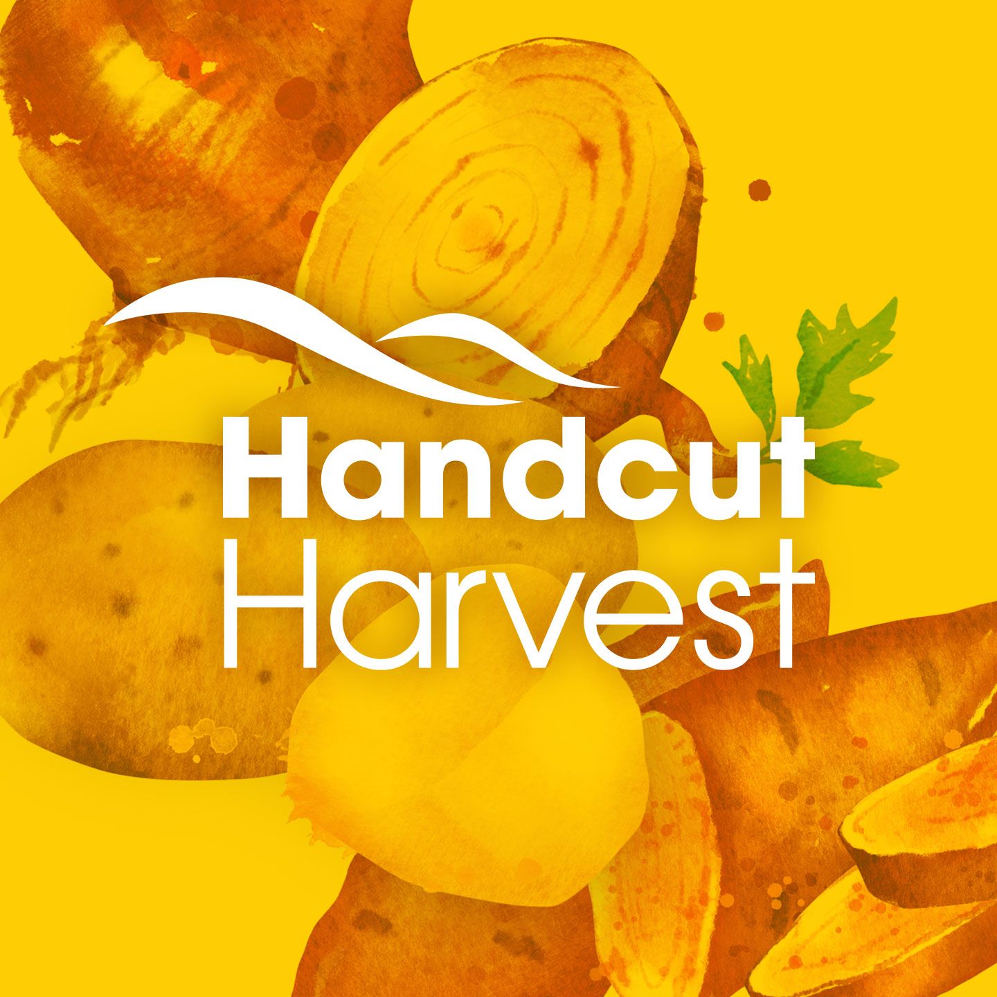
Working closely with the Wickham team, dms CREATiVE led the development of the Handcut Harvest launch materials.
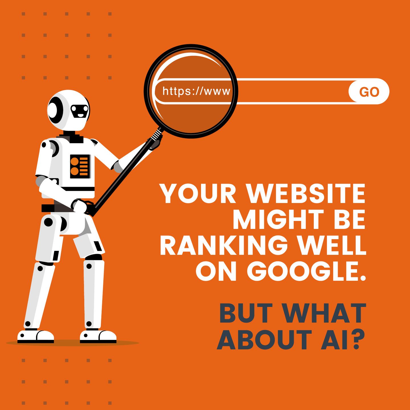
AI is changing how customers search and choose businesses. Discover why your website might be invisible to AI—and how to stay seen and relevant.
START A CONVERSATION WITH dms CREATiVE!
If you would like to talk further about engaging our services, please give us a call or fill out the form below to arrange an obligation-free meeting.