REBRANDING + Repositioning For Growth
Killarney Memorial Aged Care
Killarney Memorial Aged Care had experienced significant growth, expanding its services far beyond its original scope. The not-for-profit organisation, located in the small regional community of Killarney, had over time integrated a diverse range of offerings, including a medical centre, home care services, NDIS support, and was preparing to take over the local swimming pool.
The problem – both the residential aged care facility and the broader organisation were branded as “Killarney Memorial.” This lack of clarity made it difficult for stakeholders, clients, and the community to fully understand the breadth and diversity of its services hampering efforts for community engagement and growth.
Recognising the need for a cohesive and future-focused brand, the organisation sought to cost-effectively reposition itself with a name and identity reflective of this evolution.
Enter dms CREATiVE.
In the absence of formal market research, the team at dms CREATiVE led a thorough process of in-depth consultation with the board, CEO and project team. We worked collaboratively to align brand vision and expectations, develop a new name and brand aligned to their mission, and deliberately position them for long-term sustainable growth.
“Our challenge was to create a cohesive identity, reflective of the organisation’s diverse services while capturing the vibrant energy and community spirit at its core,” says Kym Ebenestelli, dms CREATiVE Director and Head of Brand Strategy. “We needed to ensure the new brand deeply connected with the ageing local community while also supporting future workforce attraction efforts.”
Kym Ebenestelli, Director, Head of Brand Strategy
A branded house
We utilised the Branded House model, unifying the diverse service offering under a single, cohesive identity, leveraging the strength of the K-Life parent brand and ensuring consistency across all service areas. We collaborated with the project team on naming conventions and designed a suite of logos for the parent brand and its subsidiaries, all thoughtfully rolled out to reflect K-Life’s commitment to vitality and community.
“The Branded House model was the perfect choice for K-Life—it provides cohesion across their services while allowing flexibility for future growth and diversification,” explains Kym. “This strategy ensures that every part of the K-Life brand feels connected to the larger vision of enablement, liveability and wellness.”
Kym Ebenestelli, Director, Head of Brand Strategy

Bringing a vision to life
Our comprehensive rebranding solution brought K-Life’s vision to life through key deliverables, including:
Development of new name
Renaming Killarney Memorial to K-Life immediately evokes feelings of local pride, connection, empowerment and enablement.
Brand identity design
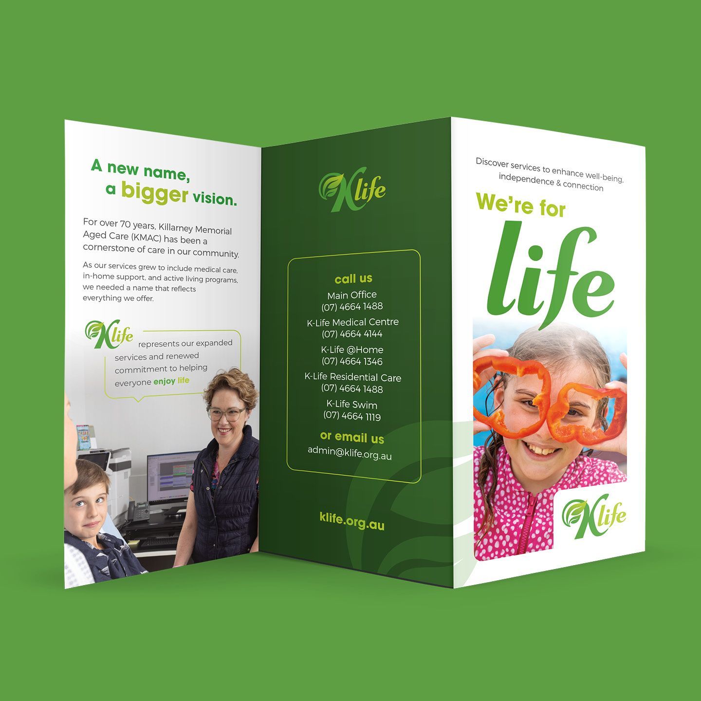
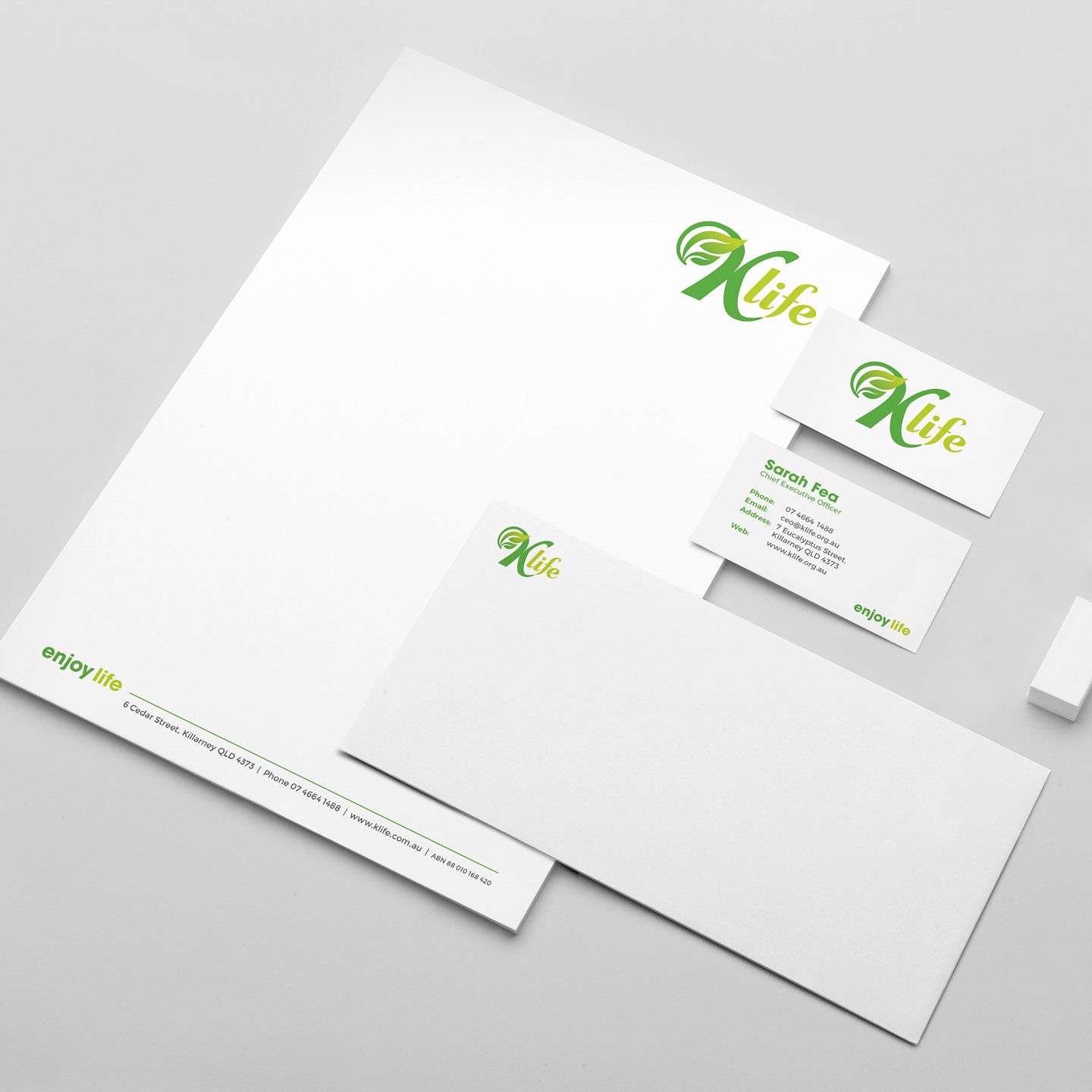
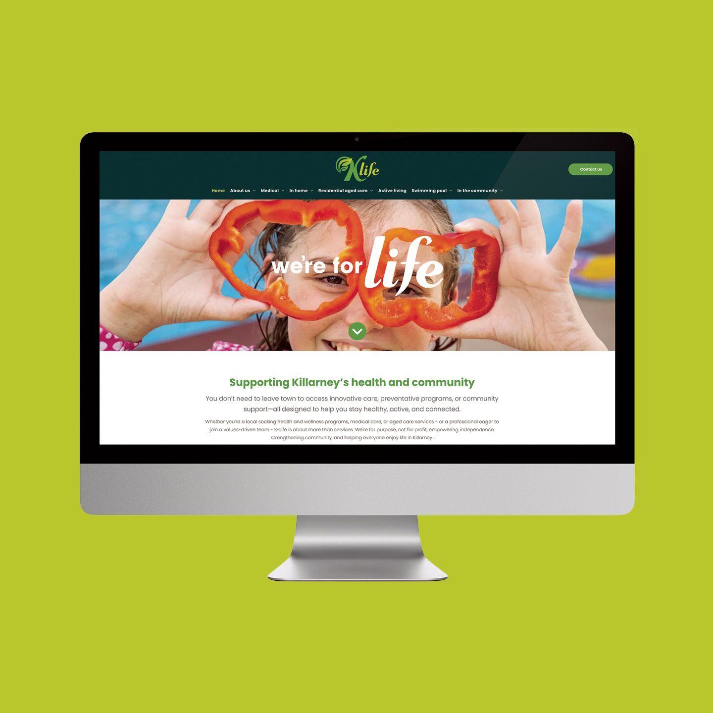
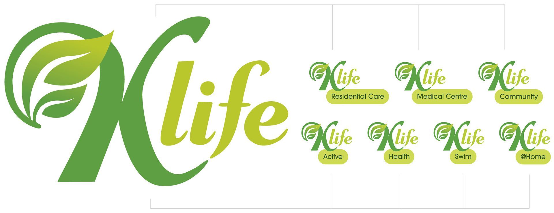
We created a vibrant, approachable logo featuring a symbolic leaf, paying homage to Killarney Memorial’s legacy tree emblem and the verdant aspects of Killarney itself. Upon closer inspection, the leaf reveals two smaller leaves joining to form a larger whole, symbolising collaboration, growth, and vitality.
Strategic brand development
Through workshops and consultation, we defined K-Life’s market positioning, strategic intent and messaging to ensure the brand resonates with its community and supports long-term growth.
Sub-brand integration
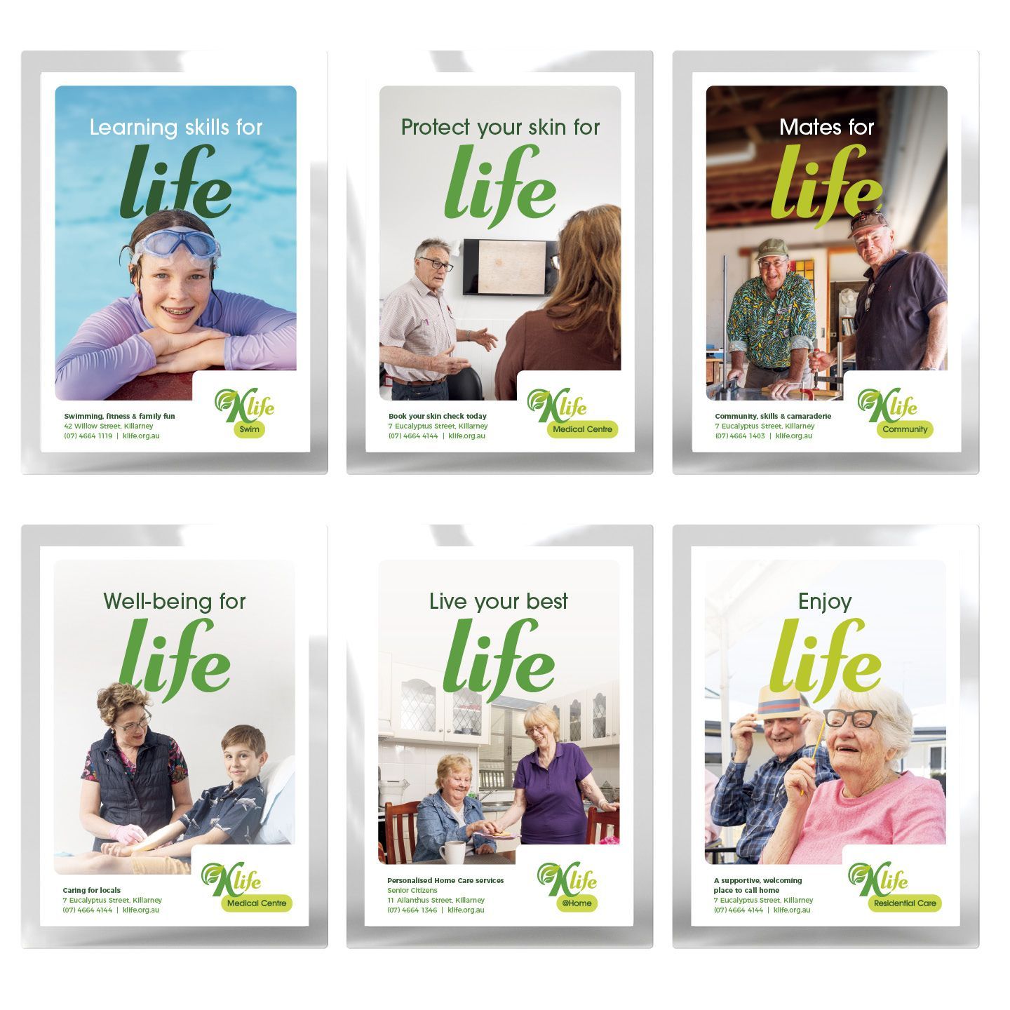
Each K-Life subsidiary received a unique identity. We utilised a lock-up system to connect the primary K-Life logo with the business name. This fosters familiarity, trust and brand consistency while eradicating confusion across the diverse service offering.
dms CREATiVE delivered.
Our comprehensive rebranding solution brought K-Life’s vision to life through key deliverables, including:
- Messaging support for the name change rollout
- A multi-day, professional photo shoot for website and marketing materials
- A comprehensive, user-friendly website, clearly showcasing K-Life’s expanded services
- A full suite of brand tools to maintain consistency across all marketing efforts
- Branded brochures, posters and other assets for use across the organisation
- Custom stationery aligned with the refreshed identity
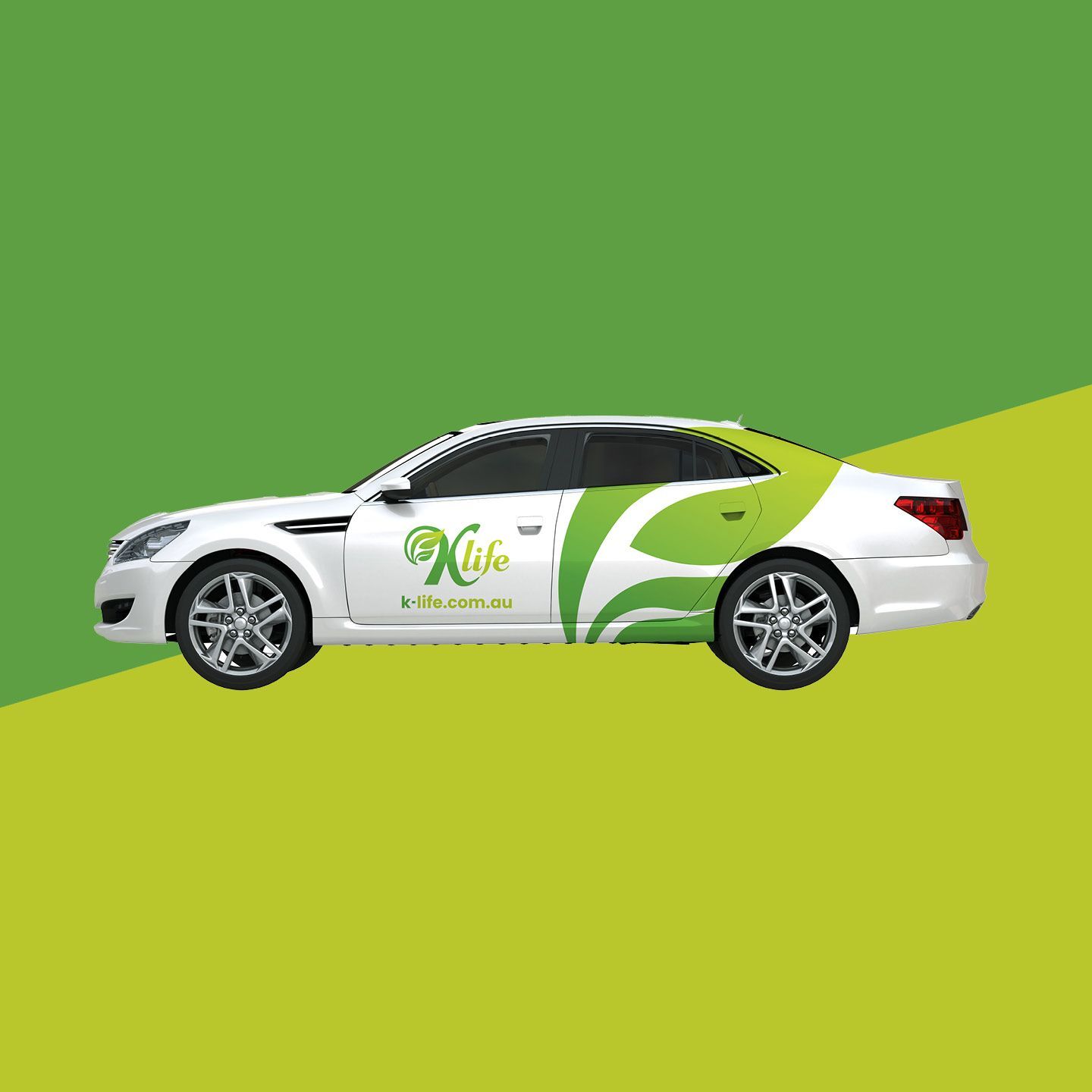
- Design of high-visibility vehicle wraps
- Social Media strategy for K-Life team to implement

A brand-new way to enjoy life
The result – a brand that resolved immediate challenges and sets the stage for long-term success.
The new K-Life brand captures the energy, optimism, and community spirit at the heart of its services. The Branded House model positions K-Life for seamless future growth and diversification while maintaining strong brand equity and cost efficiencies in marketing.
This approach unified all subsidiary businesses under a single, cohesive identity, leveraging the strength of the K-Life parent brand while ensuring consistency across all service areas. The transformation ensures K-Life is recognised as a high-quality provider of health and wellness services—vibrant, approachable, and deeply connected to its community.