VERAX HIRE - A STRATEGIC BRANDING JOURNEY
When Verax Hire rebranded from Brent’s Rents in September 2024, they weren’t just changing their name—they were redefining who they were in the market.
Based in Clermont in Central Queensland, Brent’s Rents was best known in the local home handyman and DIY market. The new owners had a big vision and were ready to shift gears and take on major projects across regional QLD and NSW.
This transformation didn’t happen in isolation; it was the result of a focused collaboration with dms CREATiVE, aimed at reshaping the existing brand identity to better align with their ambitious goals.
A transformation from family business to industry player
Brent’s Rentals was perceived as a small, family-run business mostly serving home handymen and residential builders. But when the Clermont Group acquired Brent’s, they had a vision for growth and knew they needed a brand that reflected those ambitions.
The challenge was to:
- transform the business’s identity by developing a new name, logo and brand;
- positioning the new brand to attract large-scale projects while still maintaining trust with its loyal customer base.
dms CREATiVE was brought in to help bridge this gap. Director & Co-Owner Kym Ebenestelli explains, “The Clermont Group knew what they wanted but didn’t know how to get there. Together, we created a new name, brand, website, capability and sales documents that truly captured the strength and potential of the business.”
A brand entrenched in trust and quality
Through Kym’s Brand Building Series workshops, the Clermont Group and dms CREATiVE worked to strategically set Verax Hire’s desired market positioning and messaging.
The goal? A brand that resonates with larger clients and highlights Verax’s capabilities, while reinforcing its reputation as a trusted supplier of high-quality products.
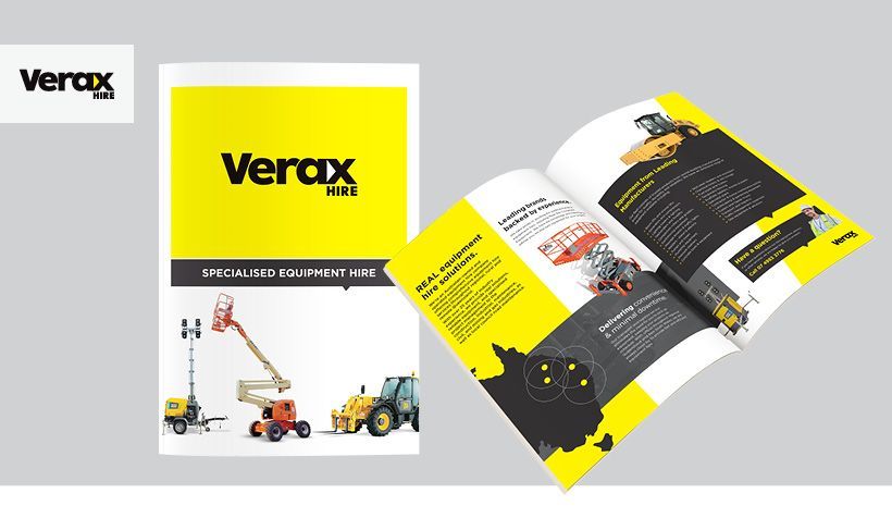
The dms team selected the new name, ‘Verax,’ to convey the company’s commitment to honesty and reliability—qualities core to their identity before developing a strong visual identity. An industrial typeface, safety-inspired colours, and powerful imagery came together to create a brand exuding strength and confidence. The Verax brand makes a strong initial impression, and communicates a dedication to quality that both current and prospective customers can trust.
The power of a well-executed rebrand
Verax Hire’s rebrand has successfully repositioned the company in the industry, appealing to large-scale clients while retaining its established customer base. With a name, brand, and website reflecting their expanded capabilities and growth, Verax Hire is now well-equipped to stand out as a leader in the equipment hire market.
Looking back on the success of the project, Kym said: “This was a significant undertaking, and it was essential to build a genuine partnership with the project team from the Clermont Group. Collaboratively, we created a brand that aligns with their aspirations and resonates with their target audience. Verax Hire’s journey shows the power of a well-executed rebrand. With a fresh identity that aligns with their vision, Verax is set to continue its growth trajectory, providing high-quality equipment and exceptional service to clients across Queensland and NSW.”
Explore the transformation from Brent's Rents to Verax Hire! Our case study invites you to delve into the strategic rebranding steps, challenges we navigated, and the innovative strategies that powered our success. If you're looking to revamp your own brand, this is a must-read.
SEE SOMETHING YOU LOVE? SHARE IT!
>> VIEW OTHER POSTS