IS YOUR BUSINESS READY FOR A REBRAND?
Local and well known Darling Downs Optometrists Chas Sankey Fraser has undergone change and brought new life in their business with a rebrand. As a part of this we developed all sorts of amazing collateral and brand elements that we want to share with you.
It also begs the question – could your business be ready for a rebrand?
THE BRIEF
After 26 years, Chas Sankey Fraser was moving from one high profile location in Toowoomba to another and there was concern existing clients would not receive the message of the new premises. With the unique business ownership structure within the group we also needed to create a unique identity for Chas Sankey Fraser which would allow current and new customers to connect with the brand, be aware of the location change and continually make recurring appointments.
OUR SOLUTION
In order to rid any worries of losing customers with the move, a rebrand and an educational campaign was developed to ensure the move was seamless and Chas Sankey Fraser customers remained connected.
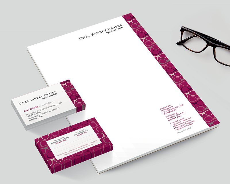
As a part of the rebrand we updated their existing logo. Using a type based logo for greater flexibility, we integrated an elegant, high-end font drawing inspiration from exclusive fashion brands & the high fashion frames that Chas Sankey Fraser stock.
We selected plum, burgundy, taupe and merlo colours to add to the sophistication and royal feel of the brand and created a graphic device of a repeated glasses frame image that complements and supports the logo.
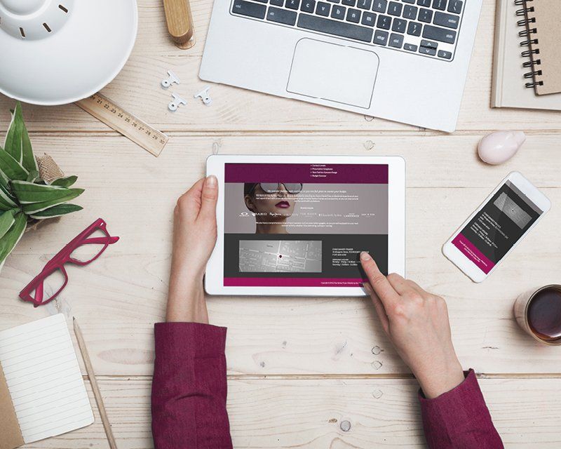
A brand rule was developed that all photography needed to meet certain criteria such as depicting the ‘lifestyle’ around premium glasses, rather than just the glasses as a product. We also ensured both males and females were represented in the imagery. We updated a letterhead and business card to ensure consistency across touchpoints and a brand new website was developed using design consistent across all the other elements. Wording was developed for the website to reflect the sophistication and specialties of the Chas Sankey Fraser team and meet SEO and industry-best web practice.
Two separate marketing campaigns were also implemented. The first being an abandonment campaign using vintage imagery and in-store incentives to engage with customers who no longer visit Chas Sankey Fraser, encouraging them to visit again and also inform them of the new location.
A recall campaign was also issued to more regular customers, using bold imagery and incentives to reach out to existing clients who may be due for their regular appointment. This campaign assisted in generating bookings but also to communicate the message of a relocation.
WHERE IS THE BRAND POSITIONED NOW?
The rebrand of Chas Sankey Fraser successfully retained customers throughout the move of their premises. It has also reaffirmed their position as a premium service offering with skilled optometrists who use the latest technology, techniques and methods, where customer service is crucial, and superior products are aplenty.

SEE SOMETHING YOU LOVE? SHARE IT!
>> VIEW OTHER POSTS
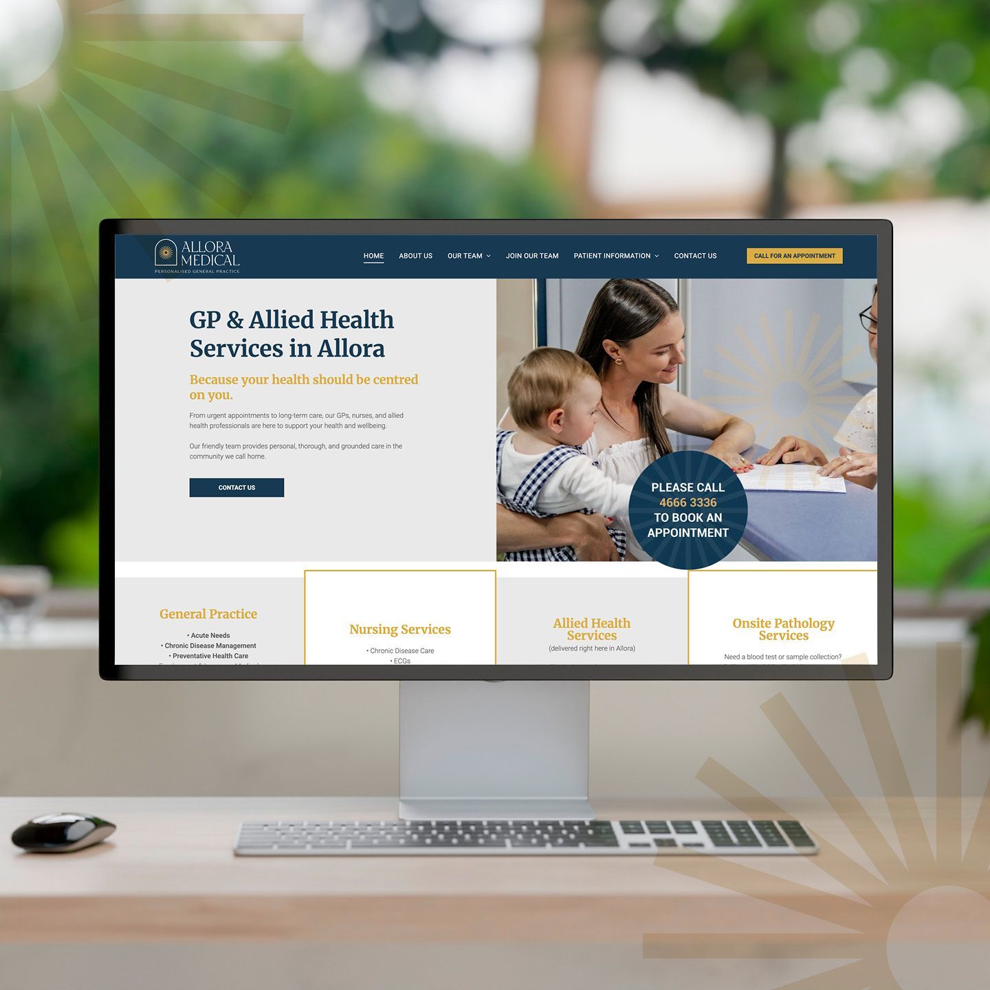
When Dr Claire Schmidt from Allora Medical came to us, she was ready for change. Under her leadership, the practice had evolved — embracing a more personal, community-driven approach to healthcare. But the existing brand and online presence wasn’t telling that story. The website and socials felt dated and didn’t reflect the warmth, professionalism and genuine care that the team delivers every day. It was time for their digital presence to catch up with who they truly are. The Challenge Allora Medical needed a brand and website to reflect their real point of difference — the human connection at the heart of their practice. This isn’t a place for “six-minute medicine.” It’s a place where people matter, where care takes time, and where patients felt known. Yet visually and strategically, that message wasn’t coming through. The practice faced an additional challenge: attracting and retaining health professionals in a rural location. The brand needed to communicate trust and expertise to patients, as well as genuine opportunity for potential team members. Our Approach At dms CREATiVE, we began by realigning the brand to better reflect the spirit of Allora Medical. We refreshed the logo and visual identity to convey warmth, care, and community pride - an elegant evolution to retain recognition while elevating the overall presentation. From there, we developed a website balancing compliance with genuine connection — a modern, mobile-responsive platform that’s easy to navigate and effortless for the team to update. Authentic photography of the team and surrounding Allora landscapes played a vital role in grounding the brand in its local context. The result is a website that doesn’t just inform — it feels like Allora. To support long-term goals, the site works hand-in-hand with their social media strategy, helping to humanise the practice and position Allora as an attractive destination for health professionals seeking a rural lifestyle with city convenience. The Outcome The new Allora Medical website now mirrors the experience patients receive the moment they walk through the door — personal, professional, and proudly local. It gives patients confidence in their care and helps prospective staff see Allora as a place where careers and community thrive together.

A bold, purpose-built new website that positions Joe Wagner Group for its next phase of growth — and confirms dms CREATiVE as the go-to partner for strategic, conversion-focused brand and website development.

Working closely with the Wickham team, dms CREATiVE led the development of the Handcut Harvest launch materials.

AI is changing how customers search and choose businesses. Discover why your website might be invisible to AI—and how to stay seen and relevant.
START A CONVERSATION WITH dms CREATiVE!
If you would like to talk further about engaging our services, please give us a call or fill out the form below to arrange an obligation-free meeting.