INTRODUCING VERONA…
An exquisite brand for an exciting new property development.
The dms CREATiVE team have recently had the pleasure of crafting a new brand and suite of marketing and sales materials for the stunning Verona Apartments development.
We are excited to share with you what we have created and the process we took to get there.
THE BRIEF
We were initially briefed on the proposed development of an exclusive collection of apartments in East Toowoomba.
This unique development is unlike anything else previously seen in Toowoomba so it commanded a premium brand that would stand out in the market and truly capture the imagination of the target audience.
Here’s how we came up with the solution…
OUR SOLUTION
We commenced the process by undertaking an intensive STRATEGY SESSION with the property developer’s team, facilitated by one of our marketing professionals. This workshop allowed us to gain a deep understanding of the project, define the target market, and use a BRAND ARCHETYPING exercise to develop the desired brand personality moving forward.
From this session, we had developed a clear brand direction and then used this insight to create a sophisticated and elegant BRAND IDENTITIY for the project that would resonate with potential residents. The LOGO overlayed on lush foliage and the moody colour palette took the brand to a premium level and perfectly represented the contemporary architecture and intimate interiors.
The brand was firstly rolled-out to various STATIONERY items such as business cards and email signatures and then onto the all-important SALES COLLATERAL.
A strong set of KEY MESSAGES were developed to form the basis for the marketing and sales content to ensure the brand messaging remained consistent across all mediums and establish trust in the market.
We knew we had to ‘wow’ the market and worked with the client to devise an innovative SALES STRATEGY to create desirability and nurture sales leads. Simple yet stunning INVITATIONS including a foiled print and sumptuous textured paper stock were hand delivered to a select group of potential purchasers along with a potted fern. The recipients were then contacted by the Verona Sales Executive to book in their exclusive personal preview.
At the preview, the client received an impressive SALES BROCHURE which was designed as a follow on to the invitation and crafted to connect with the audience. The words and visuals were carefully considered to paint a vivid picture of the Verona lifestyle and build strong desire and interest in the exclusive project. The brochure design was kept clean and simple, exuding luxury and printed on the same beautiful textured stock as the invitation.
To generate further sales leads in the initial exclusive preview phase, potential purchasers were provided with POSTCARDS to pass on to friends and family encouraging them to book in their personal preview.
A WEBSITE was then built to introduce the project and allow users to register their interest online. The clean, simple website design tied in seamlessly with the other marketing and sales materials, creating both an aesthetically pleasing and functional online user experience.
THE RESULT
An elegant brand that reflects Verona’s timeless sophistication, and a successful and unique sales and lead generation strategy that has captivated the market.
Let us know what you think.
SEE SOMETHING YOU LOVE? SHARE IT!
>> VIEW OTHER POSTS
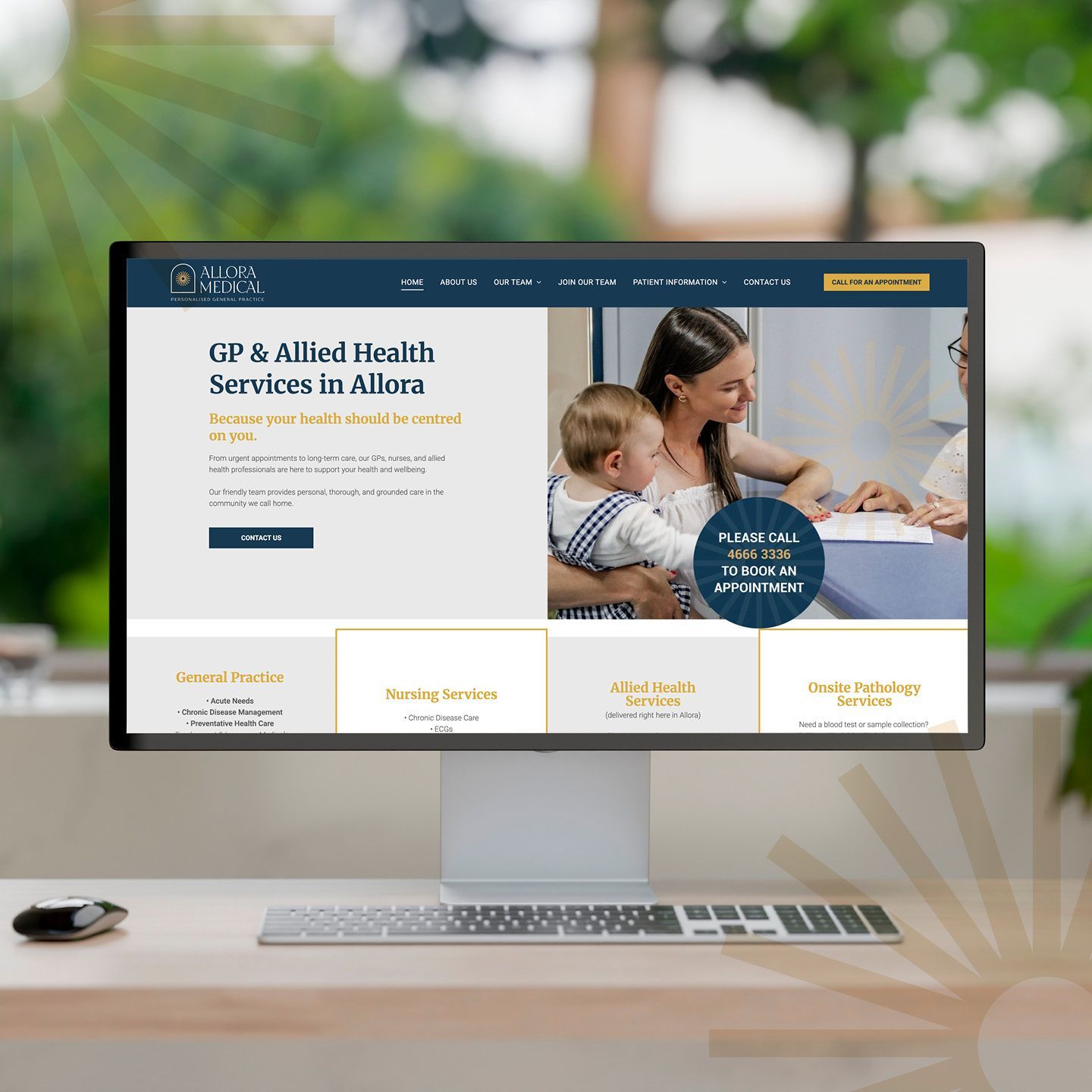
When Dr Claire Schmidt from Allora Medical came to us, she was ready for change. Under her leadership, the practice had evolved — embracing a more personal, community-driven approach to healthcare. But the existing brand and online presence wasn’t telling that story. The website and socials felt dated and didn’t reflect the warmth, professionalism and genuine care that the team delivers every day. It was time for their digital presence to catch up with who they truly are. The Challenge Allora Medical needed a brand and website to reflect their real point of difference — the human connection at the heart of their practice. This isn’t a place for “six-minute medicine.” It’s a place where people matter, where care takes time, and where patients felt known. Yet visually and strategically, that message wasn’t coming through. The practice faced an additional challenge: attracting and retaining health professionals in a rural location. The brand needed to communicate trust and expertise to patients, as well as genuine opportunity for potential team members. Our Approach At dms CREATiVE, we began by realigning the brand to better reflect the spirit of Allora Medical. We refreshed the logo and visual identity to convey warmth, care, and community pride - an elegant evolution to retain recognition while elevating the overall presentation. From there, we developed a website balancing compliance with genuine connection — a modern, mobile-responsive platform that’s easy to navigate and effortless for the team to update. Authentic photography of the team and surrounding Allora landscapes played a vital role in grounding the brand in its local context. The result is a website that doesn’t just inform — it feels like Allora. To support long-term goals, the site works hand-in-hand with their social media strategy, helping to humanise the practice and position Allora as an attractive destination for health professionals seeking a rural lifestyle with city convenience. The Outcome The new Allora Medical website now mirrors the experience patients receive the moment they walk through the door — personal, professional, and proudly local. It gives patients confidence in their care and helps prospective staff see Allora as a place where careers and community thrive together.

A bold, purpose-built new website that positions Joe Wagner Group for its next phase of growth — and confirms dms CREATiVE as the go-to partner for strategic, conversion-focused brand and website development.
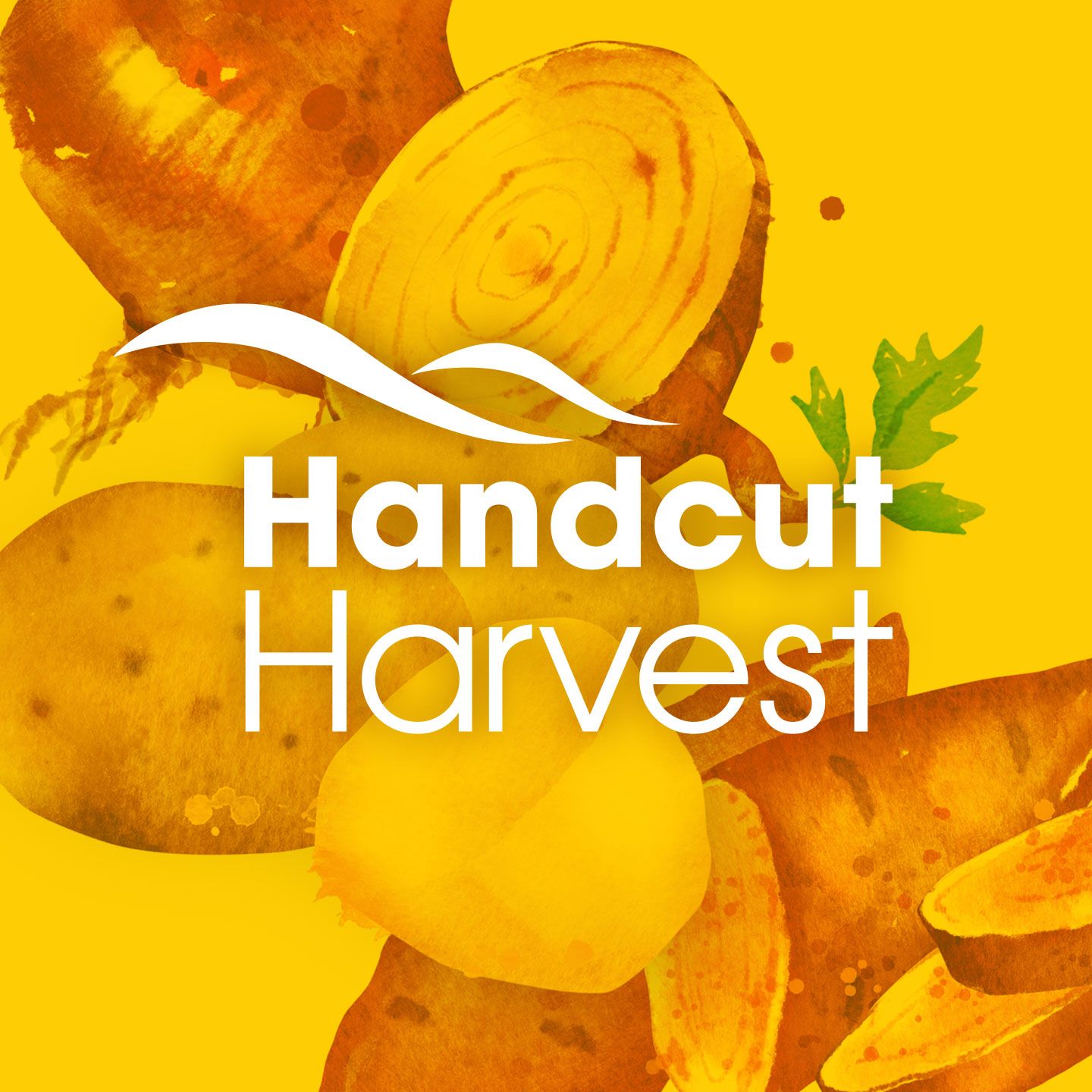
Working closely with the Wickham team, dms CREATiVE led the development of the Handcut Harvest launch materials.
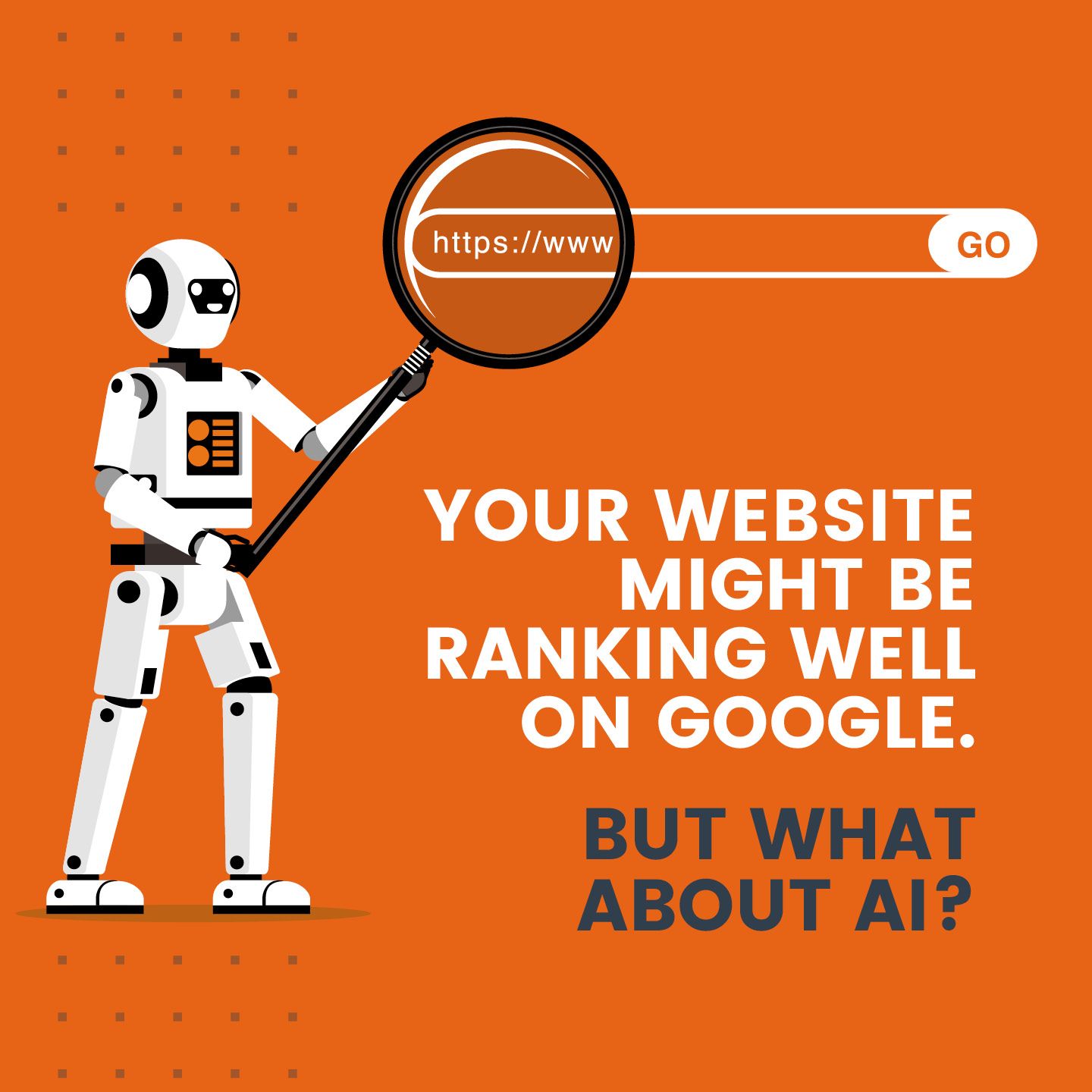
AI is changing how customers search and choose businesses. Discover why your website might be invisible to AI—and how to stay seen and relevant.
START A CONVERSATION WITH dms CREATiVE!
If you would like to talk further about engaging our services, please give us a call or fill out the form below to arrange an obligation-free meeting.