BRAND REFRESH
MORT & CO
When one of the proudest names in the Australian beef industry asks you to evolve their brandmark, it’s an opportunity you grab by the horns. “Mort & Co is such an iconic brand, not only here at its home base on the Darling Downs, but right across the nation”, explains Mark Ebenestelli, Managing Director of dms CREATiVE.
“It’s a name steeped in Australian primary industries history, so even though we’d been providing a wide range of marketing services to them for over eight years, this seemed to be the pinnacle for us – our very own ‘QANTAS’ moment, if you like - or imagine some similarly iconic Australian brand”.
Evolving with company growth and strategic direction
Though the Mort & Co master brand is synonymous with beef production and lot feeding, the vertical supply chain model adopted over the last few years has seen the business expand to include farming, stock feeds, organic fertiliser, and a transport company with its very own service centre. So, what better time to evolve the brand?
STANDING THE TEST OF TIME
“It’s a brand we’re exceptionally proud to be associated with”, says Mark. “It’s hard to believe the first Mort & Co brand was launched over 180 years ago. And today, with their vision and leadership, we’re sure they’ll be around for another 180 more.”
A balance of history and modernity
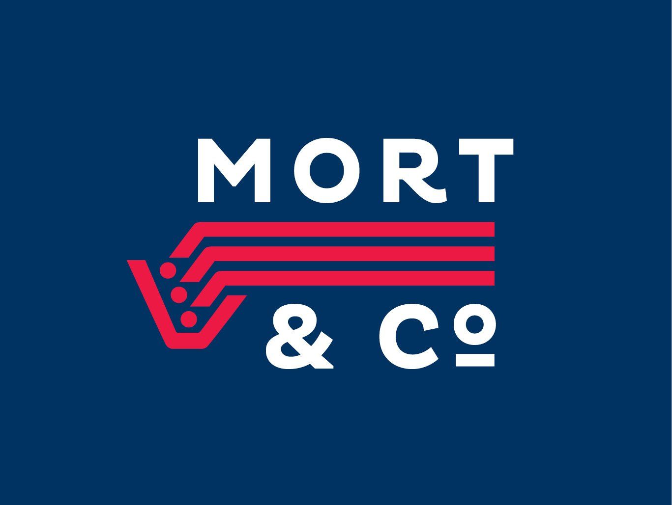
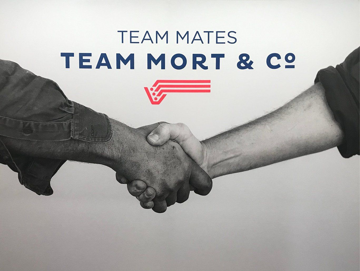
“The key for us was finding the right balance between maintaining the heritage while also modernising the logo design & branding in line with their vertically integrated offering”, explains Mark.
The ‘feed bunk’ symbol, of course, had to stay - after all, this is where the latter-day iteration of the company has come from. Ultimately, dms CREATiVE’s team of
graphic designers chose a more slim-line approach, including an extension of the horizontal lines to accommodate a much-needed landscape version of the logo.
They also modernised the brandmark typeface and the complementary communication typeface, setting it all in a slightly more contemporary colour palette. Today, the results are proudly on display across:
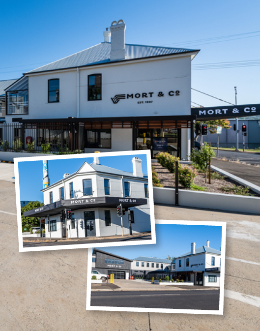
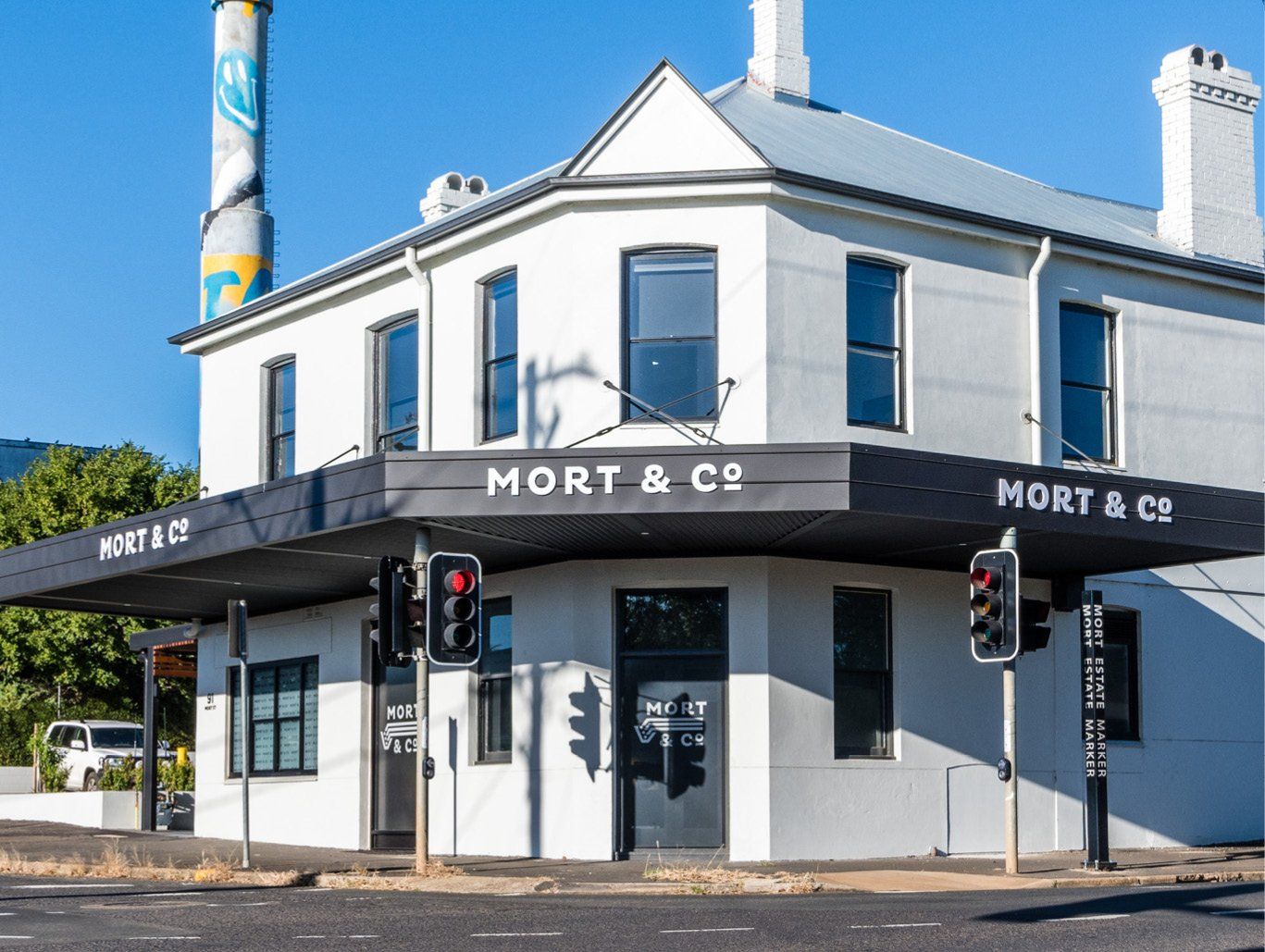
- Head office signage
- Transport livery
- Business cards and stationery
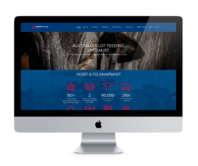
- Advertisements and marketing materials
- Trade show collateral
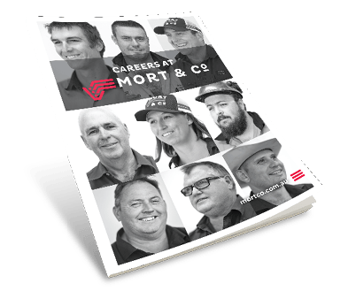
- Staff uniforms